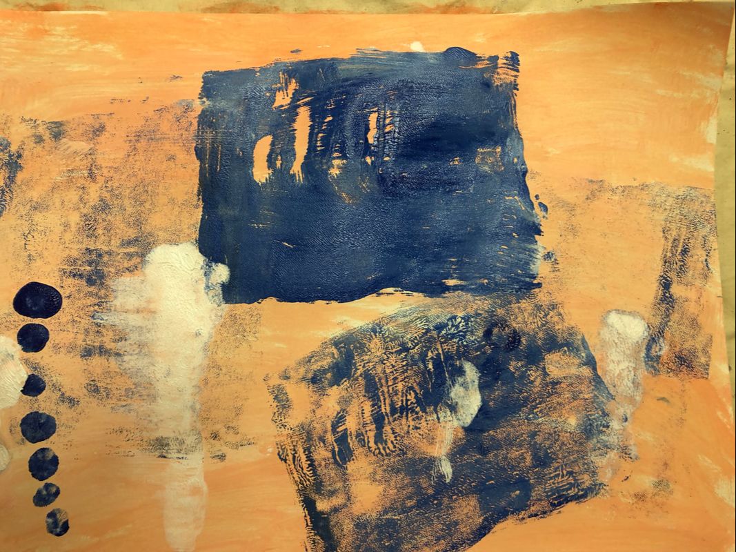
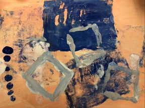
Mono Print
Exhibition Text
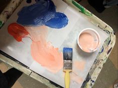
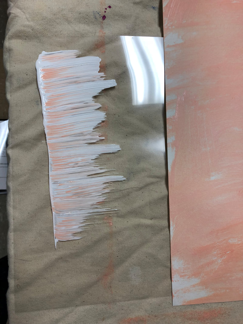
This piece is printed from plastic sheets to water color paper using acrylic paint. There is no meaning or symbolism in this piece, and was meant simply to experiment with new processes and techniques in art.
The first thing I did was grab a few colors of acrylic paints. I utilized blue and orange because they are complimentary colors and would work well together. I then wanted to used tints of both these colors so I made sure to grab white. And then I mixed my tints so that I knew what colors I would be working with.
|
Next I created a wash of a tint of orange across my water color paper. I decided to only use a limited amount of paint because I liked how the white of the paper showed through (as seen far left). This will be my background.
For the print, I used a lighter value of orange and drew a line that stemmed off to the right. This is mean to be an abstract shape that helps add texture.
|
I made a few other prints in the same fashion; I would paint a shape or design on a plastic sheet and then apply the shape to my paper. To the left shows my piece after applying a few more prints. I use asymmetric balance when placing the two large blue geometric shapes near the center, but more prints to the left of these shapes. This use of balance causes a sense of chaos.
|